Sometimes a single design decision can have a cascade effect, which causes multiple, secondary design errors. One such error, commonly made by novice developers, is to slavishly follow a pre-existing paper form to determine their table design.
Now certainly, when creating a database to replace a paper-based system, it is vitally important to assemble all of the forms and reports used in the system. It is by a careful review of these documents that the developer determines a majority of the fields he or she will need in order to store and report the information in the system. After all, if an input form has a place for Order Date, then the database needs a field to store it. Likewise, if a report displays the Order Quantity, then this information has to be stored in the database somewhere.
But paper forms are not created with proper database design in mind. They are designed to make it easy for humans to fill out. This design can be at odds with established design principles. By blindly following the paper form to determine the database design, the developer can create a system subject to numerous data and relational integrity errors.
Case Study: OB Log
Several years ago, I ran into a database that was the poster child for this error. I was asked to create a database to automate a logbook for the Obstetrics department of a local hospital. Someone in the department, who had some experience with Access, had taken a first pass at creating a database.
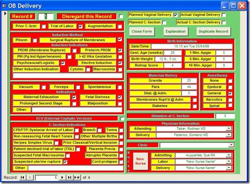
Figure 1 shows the main data entry for the application.
Figure 1: Main entry form for the OB Log database
For the purposes of this article, we're going to ignore the numerous application design errors and concentrate on the database design errors because they're much more important and difficult to fix. Nevertheless, I'd be remiss if I didn't at least mention them. They are:
- Hideous use of color. With color, less is more.
- The controls are scattered about, making the user hunt for them.
- The controls are not exactly aligned, giving the form an amateur look.
- The labels for the controls are sunken. This confuses the user as to which as to which controls data can be entered in. In general, labels should be flat, text boxes should be sunken, and buttons should be raised. Any variation just confuses users.
But these application design issues pale in comparison to the database design problems.
Base Assumption: Paper Form Design Determines Database Design
All of the problems below stem from a single assumption: the design of the paper form is also the best design for the database. As we will see, this is not the case. Let's look at the problems resulting from this decision.
Problem 1: Single table design
Because all of the information here was on a single paper form, the developer incorrectly assumed it should all go in one table. The first thing I did when I looked at the database was to open the Relationship Window. It was blank. I knew at that point the design was in trouble. There were supplementary tables, a bewildering number, in fact, but they were just look-up tables that had no relationship to the main data table.
For instance, there was a look-up table called "Dilatation," which held the numbers 1 though 10, the acceptable values for the Dilatation field. There was a table called "Hours" which held the number 1 through 12, a table called "ZeroToThree," which held the numbers 0 through 3. There were also look-up tables for the doctors and nurses.
While many of these tables were in fact useful, there were no tables to hold information representing relationships in the data. In other words, the information that was the meat of the application was in a single table. It is rare when all the information of a complex process can be stored in a single table.
Problem 2: Multiple Yes/No fields
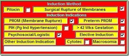
The reason complex processes can rarely be stored in a single table is because most of the time, the data contains One-To-Many relationships. For instance, each Delivery can have one or more Induction Indications, i.e. reasons why labor should be induced. On the paper form, these indications were represented like this:
Figure 2: Paper form layout for Induction Indicators
Each delivery event can have multiple reasons for inducing labor. But since you can't put multiple values in a single field, the developer chose to create 8 Yes/No fields, each representing one indication. On the form, they looked like this:
Figure 3: Portion of the application form implementing Induction Indications.
At first blush, this is a reasonable solution. You can easily query the table for one or more of these indications by testing for a Yes value in any of these fields. For instance:
SELECT * FROM OBDelivery WHERE PROM = TRUE OR PIH = TRUE
However, other, more complex queries are difficult or impossible with this design. For instance, what if I wanted a count of the following Indications: Elective Induction, Macrosomia, and Preterm PROM with a result like this:
Figure 4: Complex query counting the number of Induction Indicators.
With the single-table design, I would have to create a complex Union query like this:
SELECT "Elective Induction" AS Induction Indications, Count([Elective Induction]) AS [Count Of InductionIndication]
FROM [OB DeliveryOld]
WHERE [Elective Induction]=True
GROUP BY "Elective Induction"
UNION
SELECT "Macrosomia" AS Induction Indications, Count([Macrosomia]) AS [Count Of Induction Indication]
FROM [OB DeliveryOld]
WHERE [Elective Induction]=True
GROUP BY "Macrosomia"
UNION
SELECT "Preterm PROM" AS Induction Indications, Count([Preterm PROM]) AS [Count Of Induction Indication]
FROM [OB DeliveryOld]
WHERE [Preterm PROM]=True
GROUP BY "Preterm PROM";
If I wanted a count of all the Indications, I would have 8 separate Select statements Unioned together, one for each Indication.
However, in a properly designed database, the query to do this would be as simple as:
SELECT InductionIndications, Count(II_ID) AS Count Of Induction Indications
FROM RefInductionIndications INNER JOIN tblInductionIndications ON
RefInductionIndications.II_ID = tblInductionIndications.II_ID
WHERE InductionIndications In ("ElectiveInduction","Macrosomia","Preterm PROM")
GROUP BY InductionIndications;
So what is the proper design? The key to understanding this is to realize that you can group the individual Indication fields as values for a single field in your table. These values can be stored in a separate lookup table called refInductionIndications. If a delivery could only have one of these indications, there would be a simple One-To-Many between the Delivery table (OBDelivery) and the reference table.
However, since each delivery can have one or more induction indication, there is actually a Many-To-Many relationship. Each Delivery can have one or more InductionIndications, and each InductionIndication can be part of one or more Deliveries.
To create this relationship, you create an intersection table (sometimes called a linking table). The only two fields in this table are the primary key fields of each of the other tables. These fields become foreign keys in relationships created with the other two tables. To make sure you don’t get duplicate records in the intersection table, you make the foreign key fields a compound primary key.
In the Relationship Window, the relationship looks like figure 5:

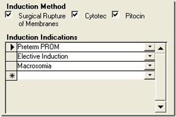
Implementing this in the application can be accomplished with a simple subform whose record source is a query based on a join tblnductionIndications and refInductionIndications. In this way, the user can select as many Induction Indications as required. The subform would look something like figure 6:
Figure 6: Subform for Induction Indications for properly designed application.
Another problem of having multiple Yes/No fields to represent grouped data falls under the heading of maintenance. What happens if a new Induction Indication must be added to the database?
With the single-table design, the table design itself would have to be modified, of course, but so would the form (a new check box would have to be added to an already cluttered form), and EVERY query and report using Induction Indications would have to be changed. This would require heavy, developer support.
On the other hand, with the proper database design (Figure 5), adding a new indication is as easy as adding a new value to the lookup table. The users can easily do it themselves through a maintenance form in the application, and it would require no modification of the application at all.
This problem was also repeated in the Vacuum/Forceps Indications and C-Section Indications sections. For each of these, the developer created multiple Yes/No fields when, in fact, a separate table was required.
Problem 3: Complex programming to Overcome Design Flaws
When a developer does not pay enough attention to the initial design, it often requires complex programming to overcome the flaws.
Problem 3a: Multiple Births
The design of the paper form also misled the original developer regarding birth information. He never asked the obvious question, what happens if there are multiple births for a single delivery, i.e. twins or triplets?
The original paper form had only one place for Birth information. When there were multiple births, hospital staff would simply use a second form, only fill out the birth portion, and staple it to the first form. This in itself should have told the developer that there was a One-To-Many relationship between the mother's information and birth information.
Because the developer was stuck with the single-table design, he was forced to create program code to: 1) duplicate all of the Delivery information into a new record, 2) delete the Birth information from the new record, and 3) allow the user to enter the new Birth information for each of the multiple births.
This design resulted in a huge amount of redundant data and opened the door for data integrity errors. If any of the Delivery information changed for a multiple-birth delivery, the users would have to edit multiple records, with the likelihood of data entry errors.
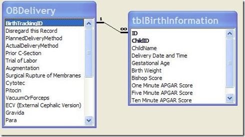
Of course, the correct design is to have a separate Birth table that is related to the Delivery table on the Primary Key field of the Delivery table (BirthTrackingID).
Figure 7: Correct design for modeling multiple Births per Delivery.
The form could be modified to have a subform for holding the Births. In this way, the Delivery information would be held only once, yet the results for each individual birth could be accurately recorded while maintaining a link to the Delivery table.
Problem 3b: Date format
On the paper form, the Birth Date/Time was displayed in a particular format: i.e. "10:15 am Tues. 05/04/99". The developer believed he needed to input the date in that format. Therefore, he created the Date/Time field as a text field and created a complex process involving numerous Toolbars, Macros, and program code to assist the user in entering the data.
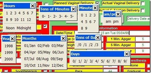
Clicking the Date/Time field produced Figure 8.
Figure 8: Series of Toolbars pop-ups when the Date/Time field was entered, which was supposed to assist the user to enter a date into a text field. A simple input mask for a date/time field would have been better.
Problem 4: Copying Paper Form Design for Application Form
This last problem is not so much a database design problem, but an application design problem. While it is I important to follow the flow of the paper form to make data entry as easy and error-free as possible, the developer should not feel constrained to slavishly imitate the layout of the paper form to produce the application form.
As the developer, you should work with the client to develop the data entry form to make it as easy as possible for the users. This may also mean a redesign of the paper form to facilitate entry into the database.
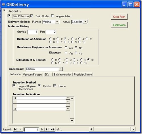
In my case, I redesigned the database form to look like this:
Figure 9: Redesigned Data Entry Form
With each group of related data in its own tab on the bottom. This led to a much cleaner design, which was easier for the data entry people to use. We also redesigned the paper form to facilitate this application form.
On-line Database Sample:
On my website, (http://www.rogersaccesslibrary.com), there is a sample database called "ReallyBadDatabase.mdb", which illustrates the problems discussed here, and another called "ReallyBadDatabaseReborn.mdb", which shows how I corrected them.
Conclusion:
Does this mean the developer should completely ignore the layout of the paper forms? No. Assembling all of the input forms and reports is a vital part of the database development process. They will provide the majority of the fields necessary to the project. But you cannot let them determine your database design. As the developer, that's your job.
In general, when dealing with a paper input form do the following:
- Look for logical groupings within the fields on the form. For instance, PROM, Preterm PROM, PIH, and Macrosomia are all Induction Indications.
- Look for relationships in your groupings. For instance, each Delivery can have one or more Induction Indications. When one entity (Delivery) in your database can have multiple of another entity (Induction Indications), this tells you there needs to be a separate table for this entity.
- When there are a series of check boxes on a form, and they all represent alternatives of the same thing, you should not create multiple Yes/No fields, but instead create a single field where the acceptable values include all the labels of the check boxes. If more than one of these values can be selected, then you need an intersection or linking table to implement the Many-To-Many relationship.
- Regardless of the formatting on the form, all dates should be entered as Date/Time fields in the database. You can format the output with the Format function to meet the users needs.
- Check with the users of the system to make sure you have accurately modeled the data and relationships of the system. Also work with them to create an application form that is easy to use. You may also have to work with them to redesign the paper form.
The developer has to delicately balance the needs of the users against proper database design techniques. In this way, the developer creates a system that is not only easy for the user, but also ensures accurate data.


No comments:
Post a Comment